
Driving Premium Subscription Renewals
.png)

.png)
Muzz, the leading Muslim marriage and social app, serving users across, serving 13 million users across 20+ global markets. It operates on a freemium model, with core business revenue driven by premium memberships.
Membership cancellations posed a significant challenge, directly impacting revenue. I was tasked with re-engaging users who cancelled their paid memberships and encouraging them to renew.
I led the design for this project, from user research to the end-to-end UX/UI process. I worked closely with a cross-functional squad that included a Product Director, Product Manager, two Engineers, a QA Engineer, and a Data Scientist.
This project drove a 1.8% increase in premium membership renewals and a 17% boost in feature adoption by reshaping user education and the re-engagement journey using behavioural design principles.
I partnered with our data scientist to analyse cancellation reasons from the app stores. Our goal was to identify the top factors preventing users from staying subscribed to the premium plan.
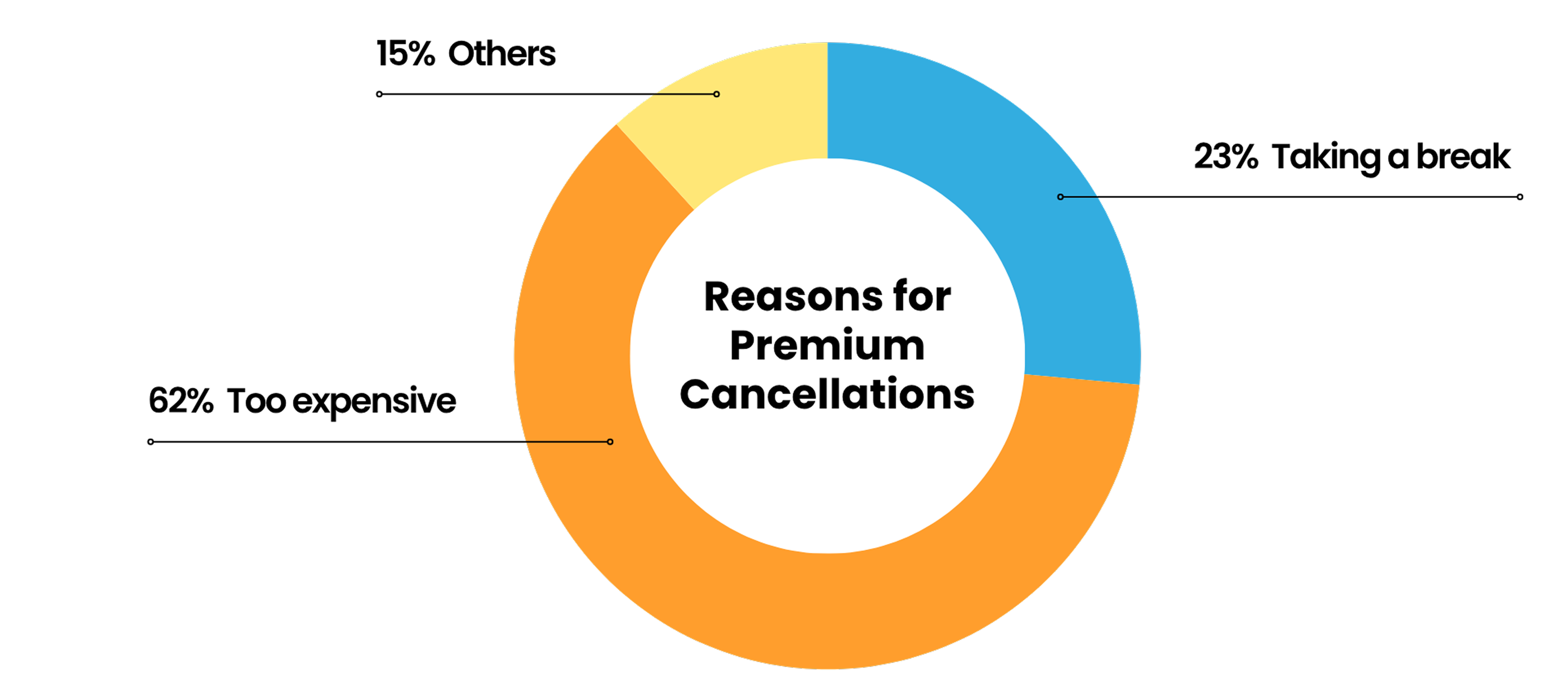
I interviewed 10 former premium members to understand their cancellation decisions. The research revealed that: many didn’t know what the plan included or use most features, so the price felt too expensive for the value they perceived.
.png)
The cancellation flow was passive: users only received a confirmation email, with no attempt to re-engage them or highlight the benefits they’d lose.

Research revealed two core issues: users didn’t fully understand the value of the premium membership, and the post-cancellation journey lacked engagement. Together, this led to low motivation and few triggers to influence their decision to renew premium memberships.
By applying behavioural principles to influence user decision-making, I aimed to drive renewal rates by focusing on three key goals:

I mapped three key stages in the post-cancellation journey where users are most likely to feel the loss of premium features. I balanced urgency with sensitivity and used repeated exposure to keep users engaged.
.png)
I explored ways to visually differentiate upsell components for freemium users while staying consistent with our design system. The goal was to make the premium upsell clear and noticeable without disrupting the overall user experience.
.png)
I partnered with our content designer and local marketing teams to ensure our tailored upsell messages felt relatable for a global audience. We focused on showing how each feature could support users in overcoming challenges in their marriage partner search.

Highlighted what users would lose to drive renewals.
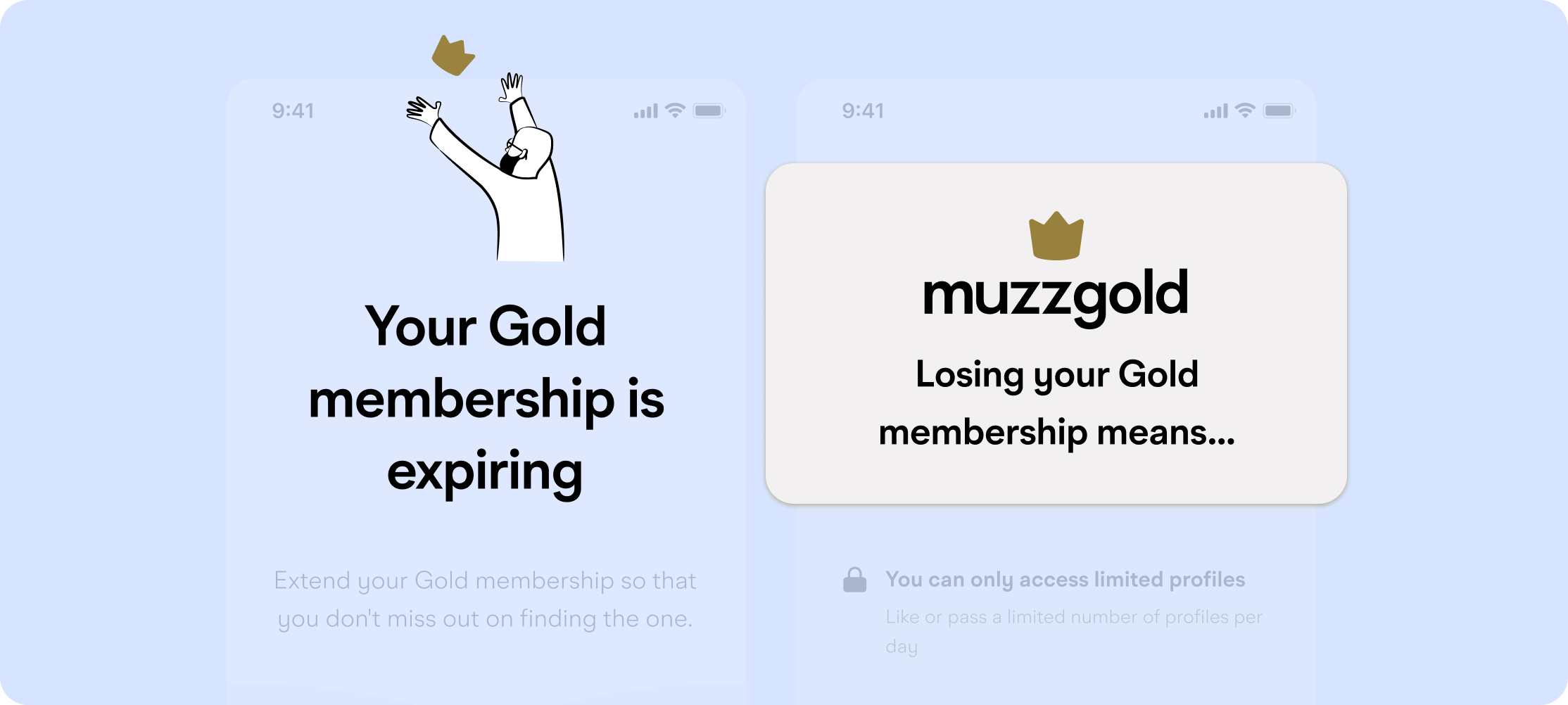
Positioned features around user goals using clear, relatable language.
Used different touch points to reinforce premium value.
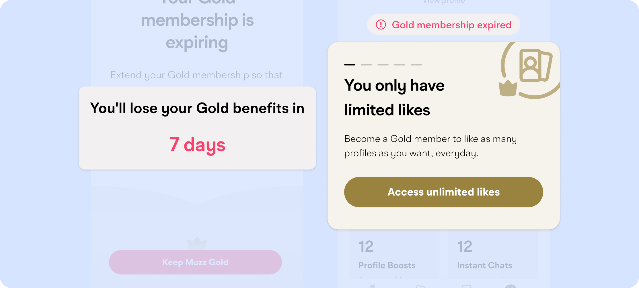
It showed the effectiveness of timely touch points in the re-engagement journey.
It indicated users better understood and valued the subscription.
I assumed listing membership benefits was enough, but user interviews proved otherwise—people didn’t see the value because they didn’t connect features to their problems. I learned that storytelling is key to making benefits resonate. Reframing the messaging to focus on solving user pain points made a significant impact, reinforcing that design isn’t just about UI—it’s about how you communicate value.
I learned to be more comfortable making decisions without having every piece of evidence upfront. Moving forward with a clear learning goal can unlock opportunities to gather the data you need later.
Segment users and run experiments with tailored content and visuals to learn what resonates best with each group.